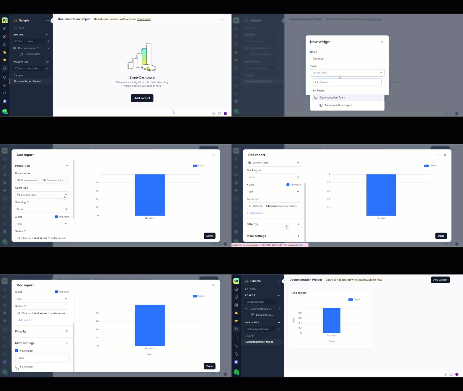
Widgets are the core components that make up a dashboard. They help you visualize and summarize the data stored. Each widget type enables you to do something different on a dashboard. Creation of a widget is either conversational or UI based with the help of settings in the UI.
To create a widget, follow these steps:
- Open the required dashboard from the left navigational panel ,in which you want to add a new widget.
- Click Add widget. The New widget dialog opens.
- Enter a Name to your widget and select Table from the drop-down list. All the tables that are available in the workspace and for which you have access to are displayed here and you can select a table. The Select column section is visible now.
- From the list of columns in the table Select a column to create a widget automatically.
- Click Create widget. The Documentation widget dialog is displayed with more options for you to select.
Note: You can either accept the default settings by clicking Done or modify any properties for your widget, add filters, and more settings to your widgets.
Select Properties for widget
You can select additional properties for your widget.
- Data source: It is shown by default based on the table you have selected while creating the widget.
- Chart type: You can select chart type from the drop-down list. The different chart types include: Line, Pie, Bar, and Area.
- Stacking: If you list multiple columns under series, unstacked value can be difficult to understand in the chart. There could be too many bars or columns side-by-side. To get a cleaner look at the chart stacking is important. Stacking takes the values from series and stacks them on top of each other.
- Series: You can add numeric columns under series. The chart depends upon the columns listed under series.
- Sub-type: For line and pie types, you can select sub-type to further customize your chart. Types under sub-types will improve your viewing experience and data will be easy to decode.
- X-axis: For line, bar, and area charts you can select a dimension from the data source to use on the x-axis.
- Y-axis: For line, bar, and area charts you can select a measure from the data source to plot on the y-axis.
Filter by
You can add a filter to the widget and view the chart accordingly. For more information about Filter by, see Perform more actions in a widget.
Add more settings for widget
The more settings include adding a name to the x-axis and y-axis.
- Click the arrow corresponding to the More settings. Select the X-axis box and Y-axis box and enter a name for each respectively.
